How to Use
The dashboard was created to allow comparison between the models registered on the platform.
This section explains in detail each of its components and how they can be used.
General or Sprint IMDC
In the dashboard’s sidebar, there is an option to display predictions for Sprint IMDC or not. When IMDC options are selected, the dashboard will display only the forecasts related to the Sprints, that is, dengue forecasts at the state level. For more details about the IMDC Sprints, see this page. This distinction was made because Sprint uses data on probable cases only.
Selecting the Disease and Spatial Options
The first step when opening the dashboard is selecting the disease and the spatial options of the forecasts you want to visualize.
If the Sprint IMDC option is enabled, specific options will be shown, allowing only the selection of the state for which you want to view forecasts — this is because Sprint provides only dengue forecasts at the state level.
If the Sprint IMDC option is disabled, the filters below can be used. In the state tab, the filters will be similar to those from Sprint and will display only state-level forecasts. In the municipal tab, you can select a specific municipality and view the forecasts available for it. In both tabs, you can filter the diseases available from the uploaded Models.
By default, in both cases, the dashboard preselects a disease and a spatial option.
Whenever these parameters are changed, the models and forecasts available in the selection box below the chart are also updated.
We will talk more about these elements in the next section.
Models
By default, all models available for the selected disease and spatial level will be shown.
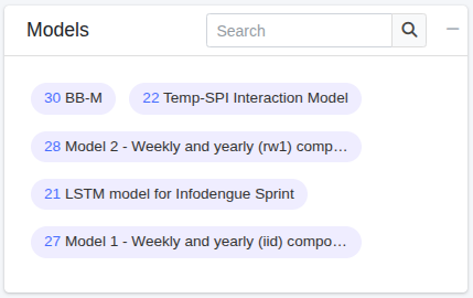
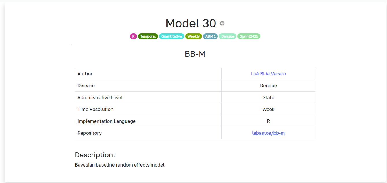
To view more information about a model, click its name on the predictions list and you will be directed to the model's page.
To view only one model's forecasts, just click on it. After clicking, the model will be highlighted with a darker color, and only the forecasts generated by it will be shown in the dashboard's forecast box.
More than one model can be selected at the same time.
Forecasts
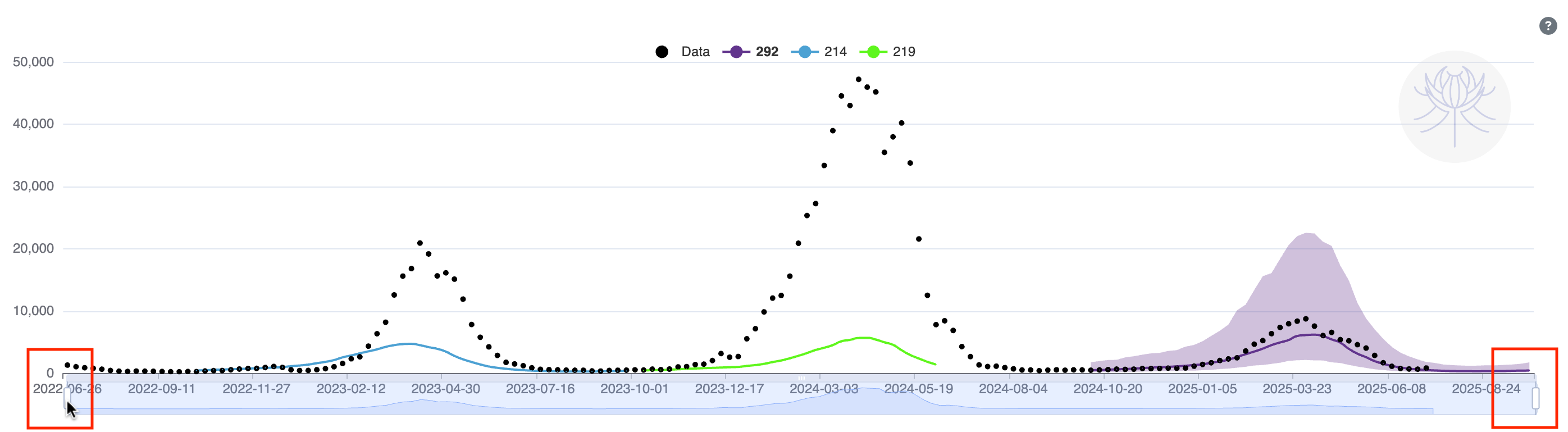
The forecast box displays all forecasts available based on the applied filters.
To plot all of them simultaneously, click the highlighted checkbox below.
To select a forecast or remove a selection, click the checkbox next to the corresponding forecast ID.
The colors in the forecast table match the ones used in the chart.
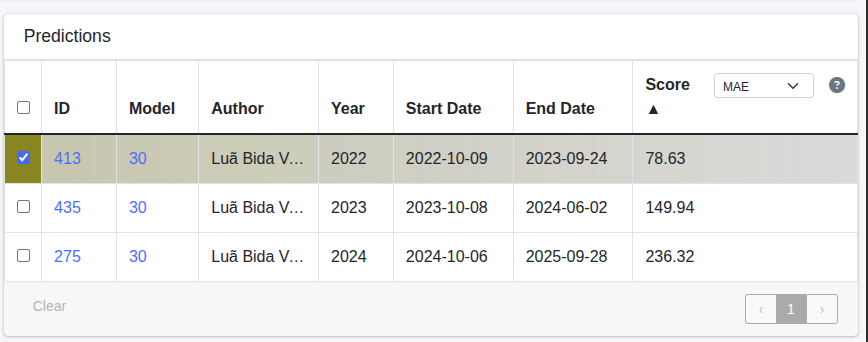
The forecast table contains the following information:
ID– Internal identifier associated with the forecast;Model Owner– Identifier of the repository model user or org used to generate the forecast;Model Name– Identifier of the repository model name. It's clickable and takes you to the model's page;Start Date– First date predicted by the forecast;End Date– Last date predicted by the forecast;Interval Bounds– Toggle the interval bounds of the model, shows the 50 and 90% bounds of the forecast;Scores– These column represents the values of a metric comparing the forecast to the observed data. (The metrics available are: CRPS, MAE, MSE, Log Score and WIS).
For more information about what each one means and how they are calculated, check scores.
Forecasts can be sorted in ascending or descending order based on these columns. Just click the column name.
Forecast Chart
When a forecast is selected, it is displayed on the chart:
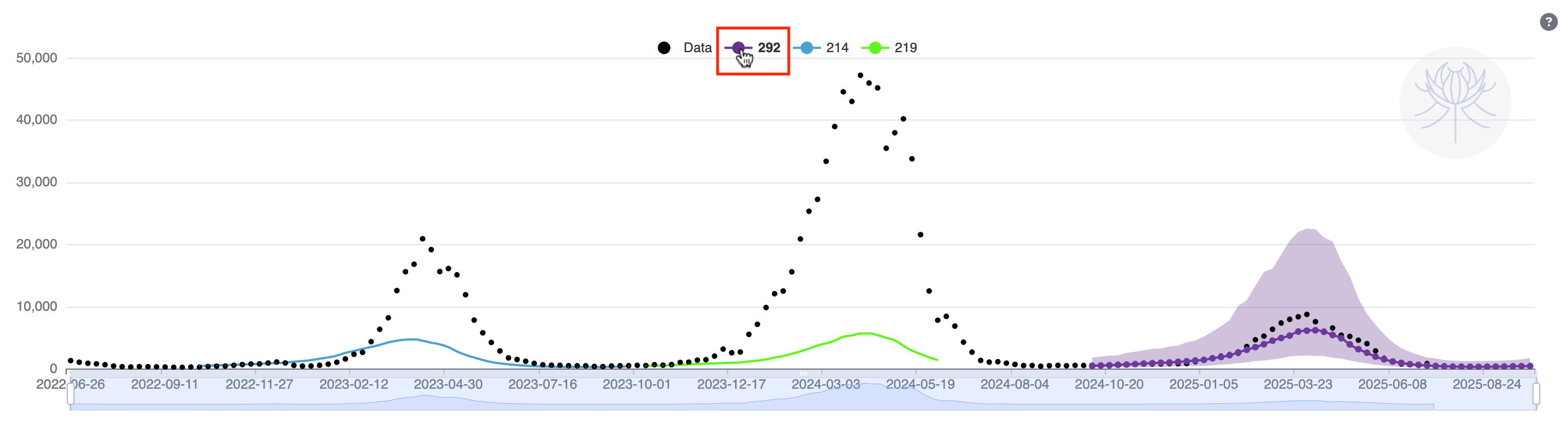
Additionally, you can adjust the date range displayed by using the mouse wheel or clicking and dragging one of the ends of the selection bar to the desired range.